Harborview Dental & Orthodontics
Dental & Orthodontics · Newport, Oregon
A warmer, more grounded identity for a family dental practice growing into orthodontics.
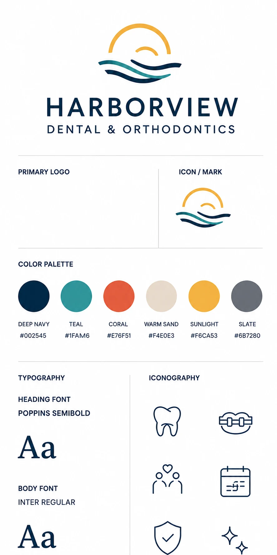
#002A46
#2A9A9A
#EEB646
#E06238
A well-established family dental practice expanding into orthodontics looked like every other practice: blue and white, stock photos, no visual difference between a routine cleaning and a multi-year braces commitment. It needed a brand parents could trust with the bigger decision.
Who it's for
Parents aged 30 to 50 choosing one practice for the whole family, with orthodontic treatment as the higher-consideration purchase driving the choice.
Brand personality
Warm but competent. Approachable without being cutesy, credible without being cold and clinical.
How we solved it
Move away from clinical blue into a warmer, grounded palette of terracotta, sage, and warm neutrals that reads as care rather than sterile.
Confident, modern typography that stays credible and adult, deliberately distinct from the playful pediatric work.
Real-feeling lifestyle photography direction over clinical stock imagery.
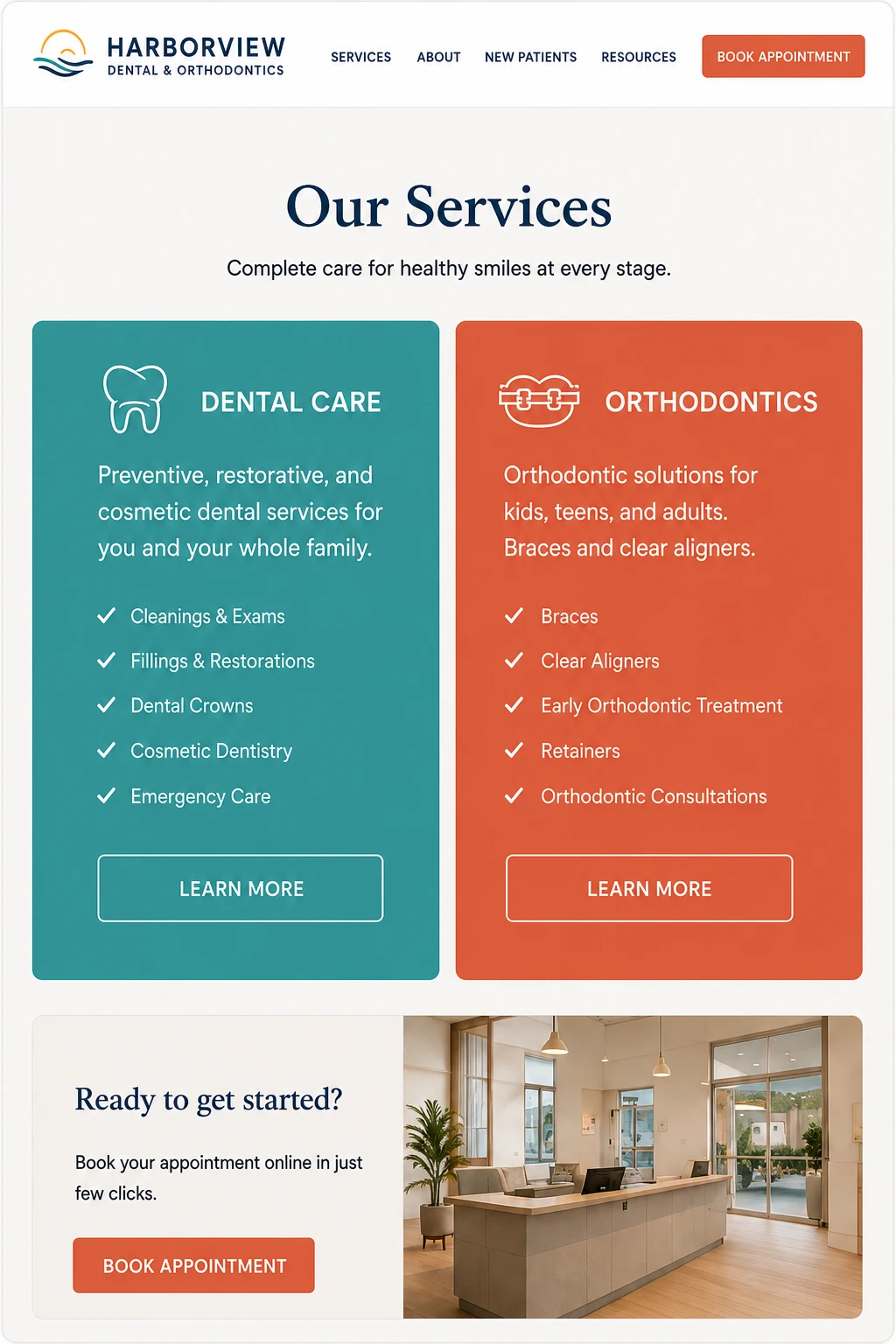
A services system that visually separates general dental from orthodontics inside one coherent brand.
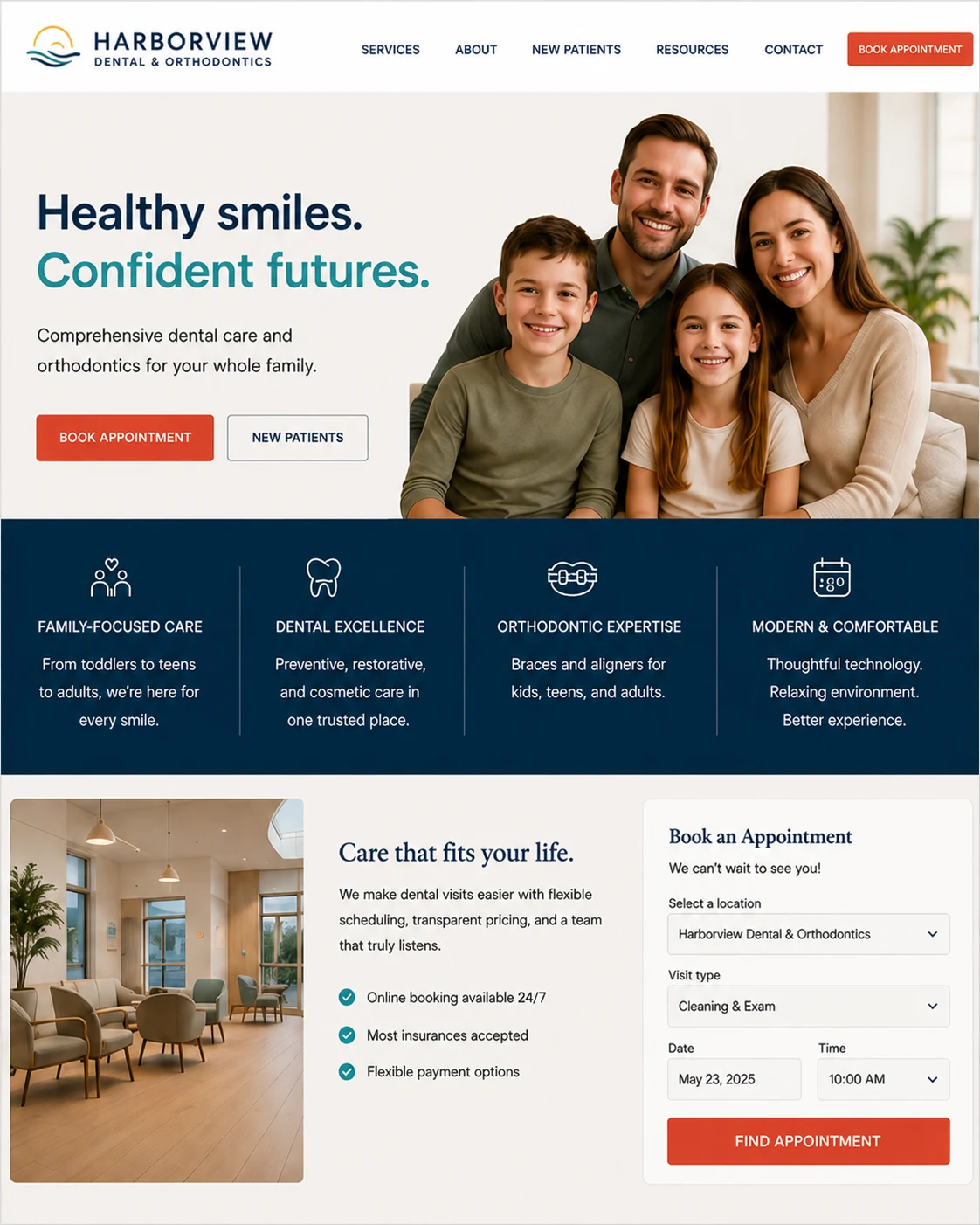
The website
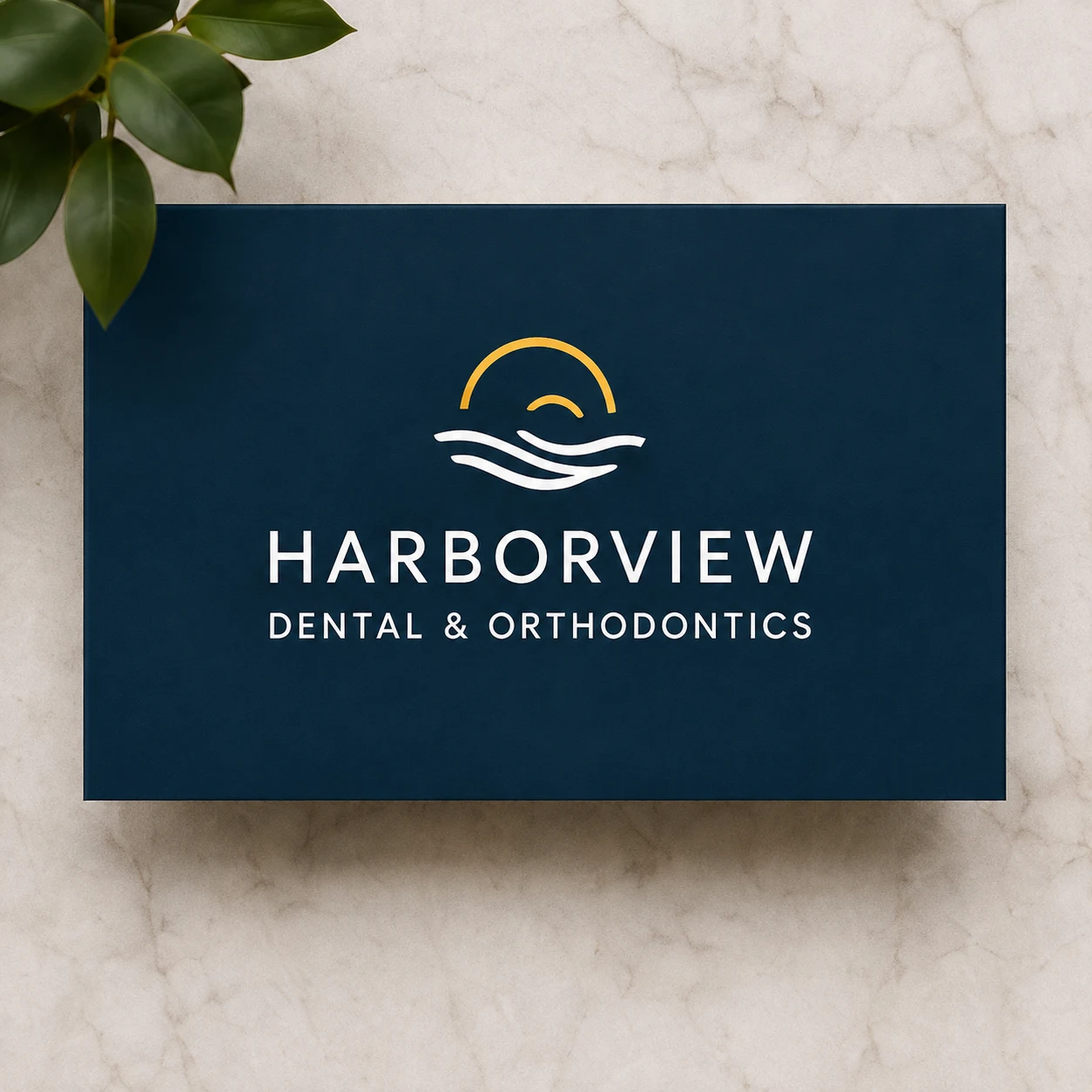
Brand identity
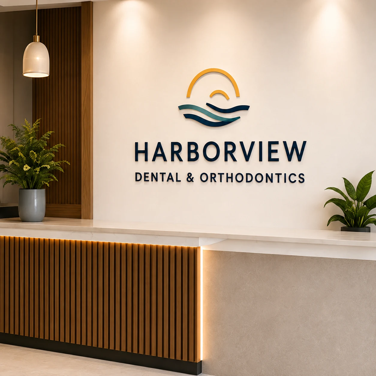
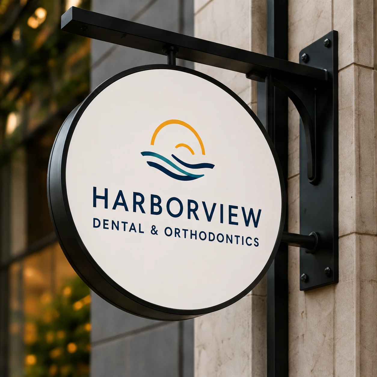
In the practice
What shipped
- Logo, primary plus icon mark
- Color palette and typography system
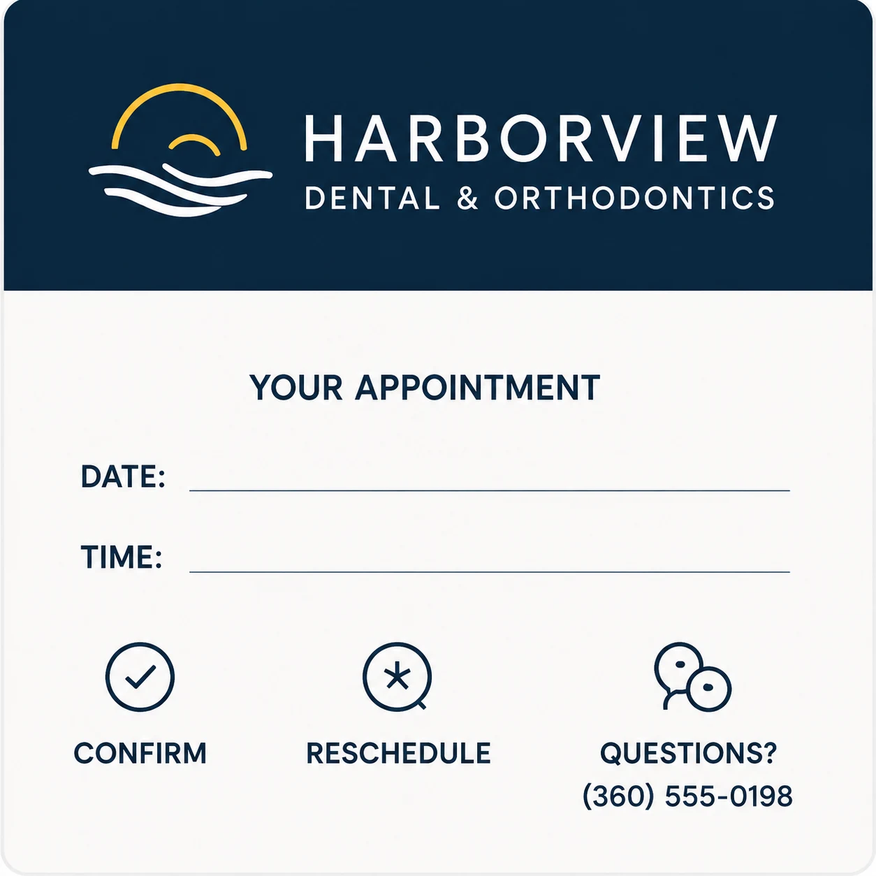
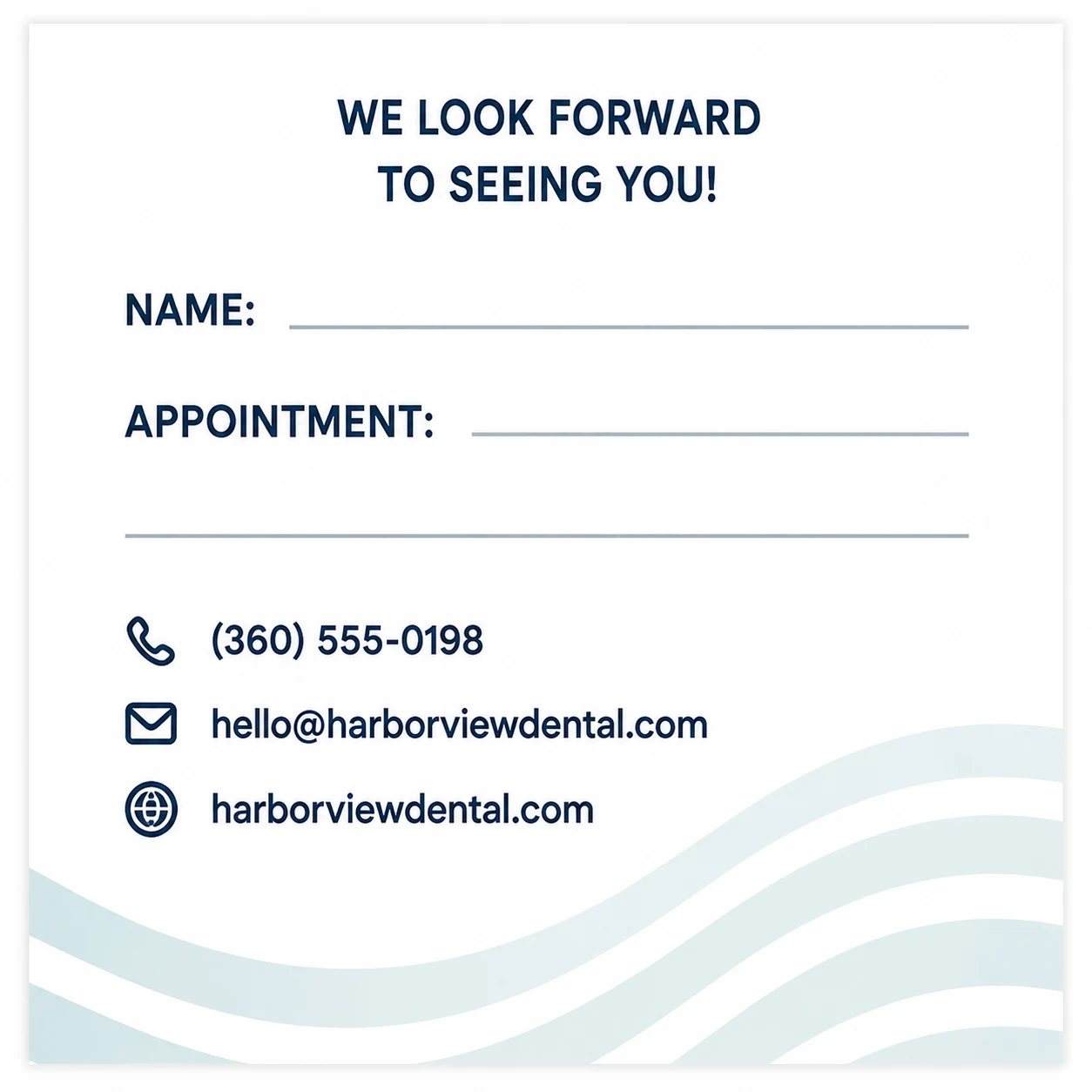
- Business card and appointment reminder card
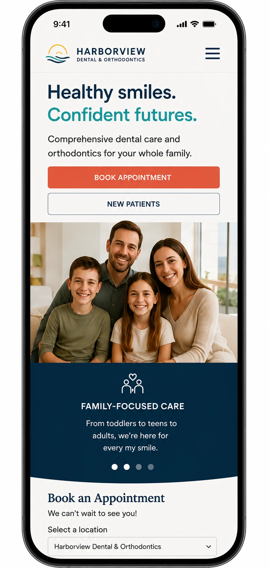
- Homepage design, desktop and mobile
- Services page template differentiating dental and orthodontic care
The build includes a visible, ADA-vetted booking widget, checked for VPAT conformance. The accessibility expertise shows up in the work itself, not as a caption.
Accessibility and privacy are part of the design, not a caption on it.
Marchetti Aesthetic Surgery
Plastic Surgery, Dr. Elena Marchetti, MD · Full brand + website
Want work like this for your practice?
Tell us about your practice and where your brand or website is falling short. We'll map the fastest path to something you're proud to send patients to.